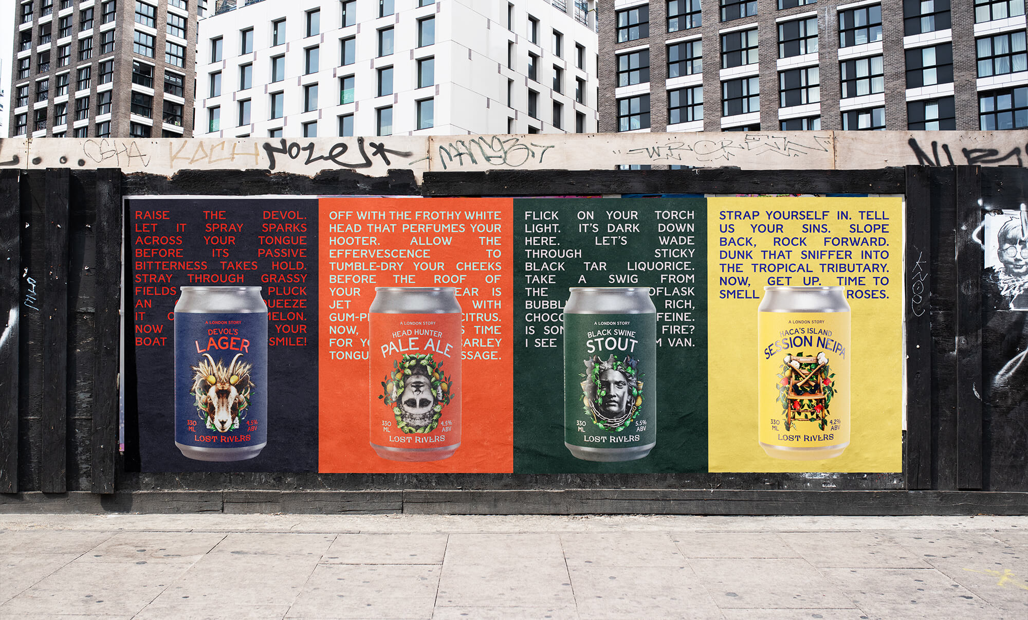
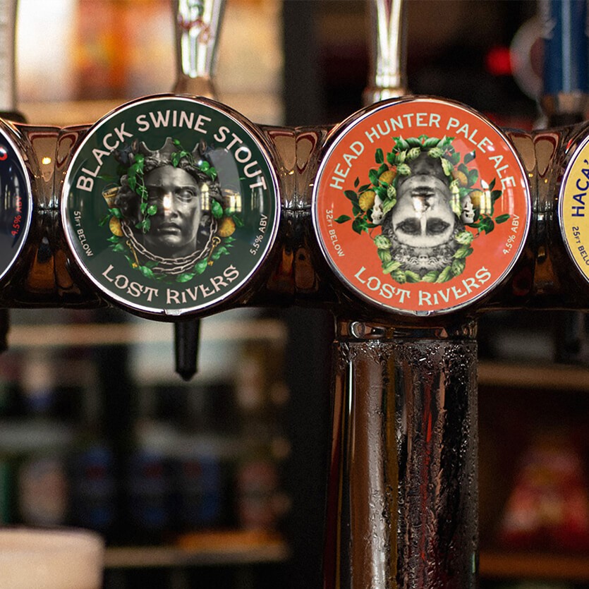
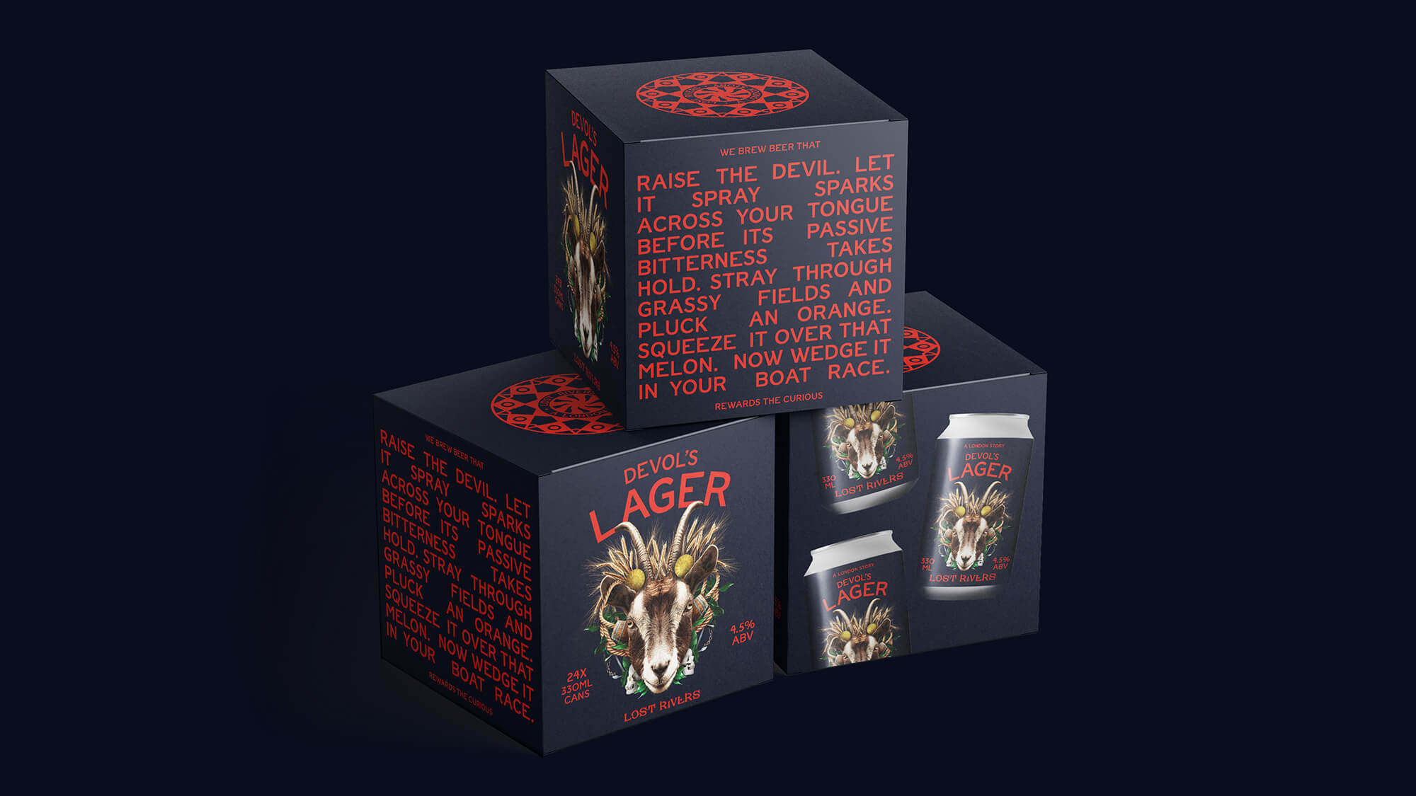
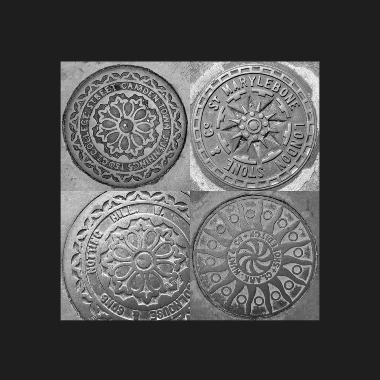
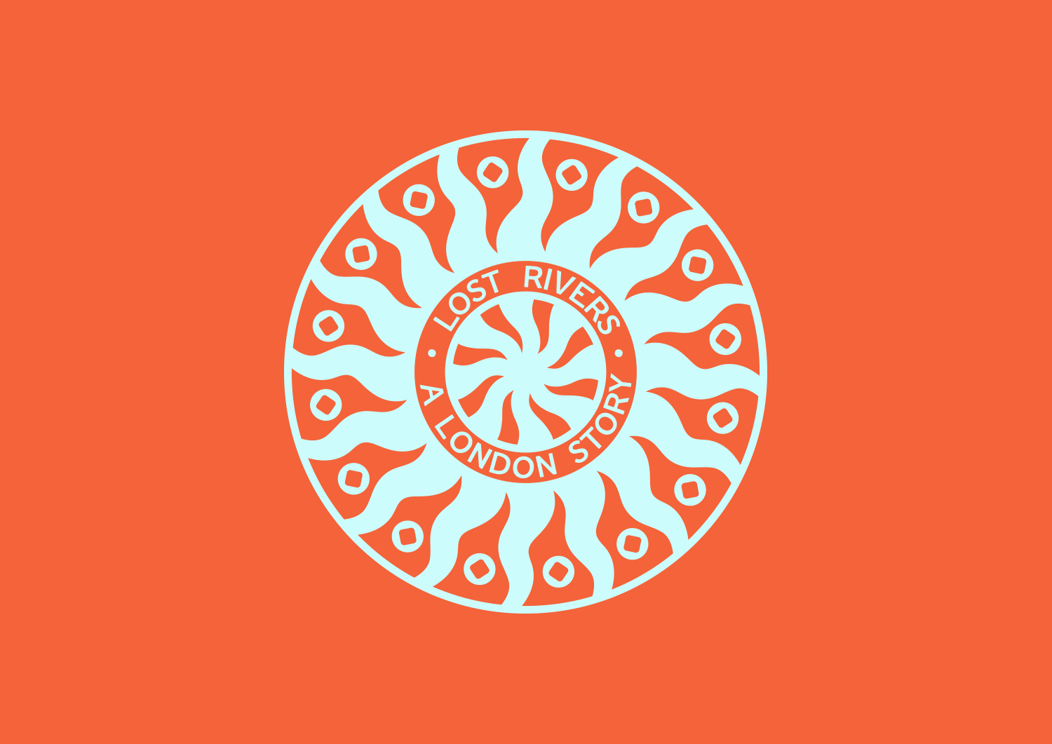
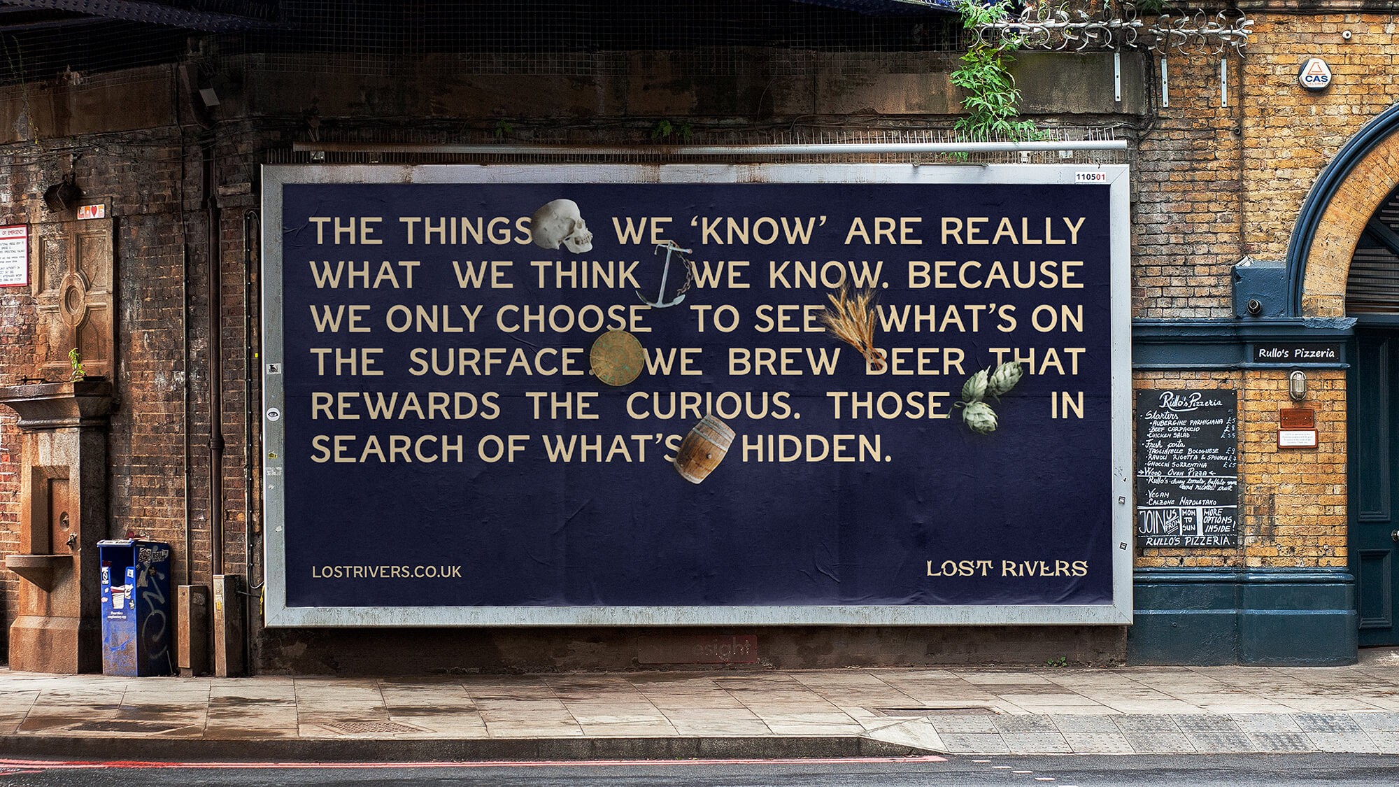
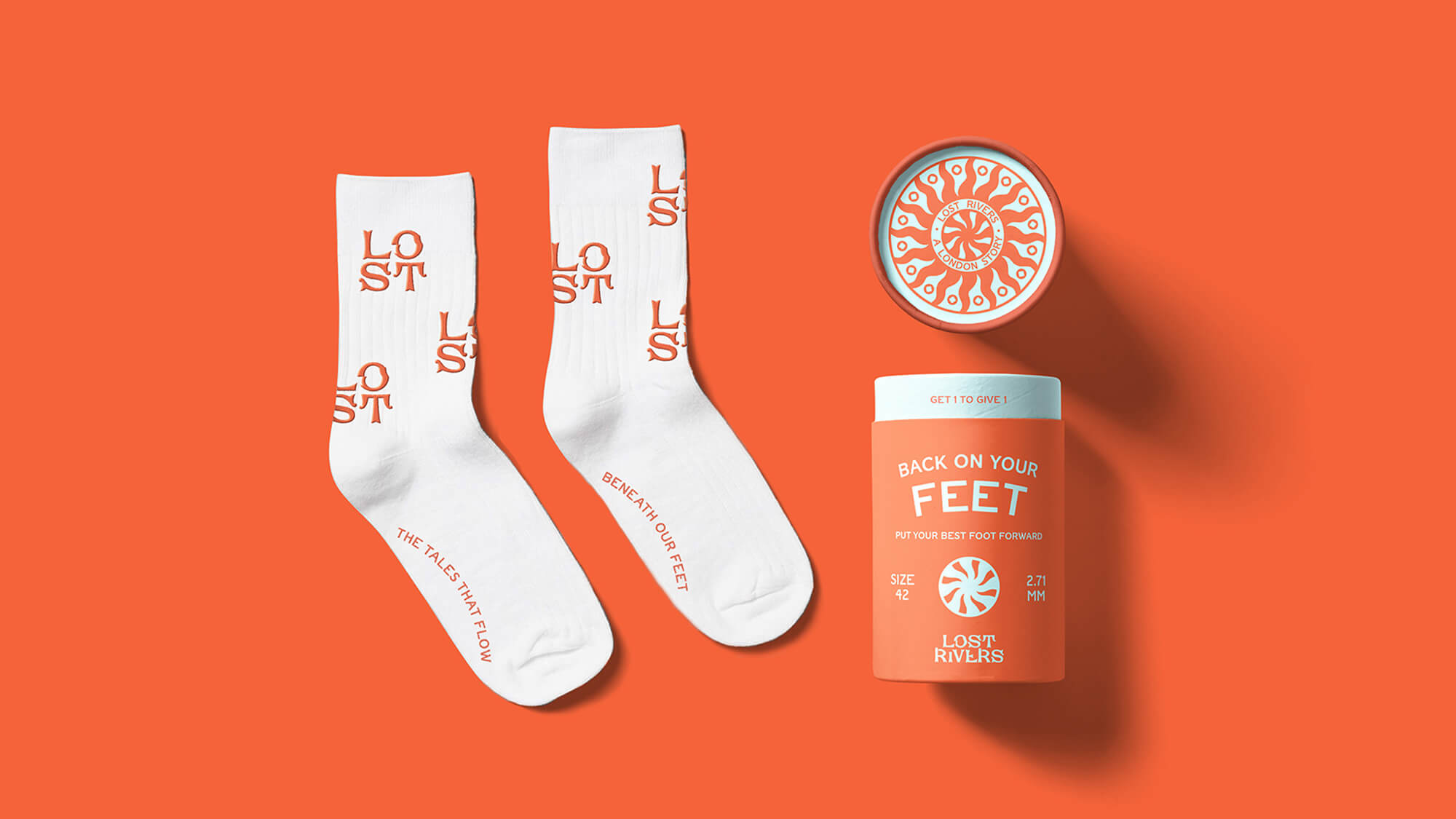
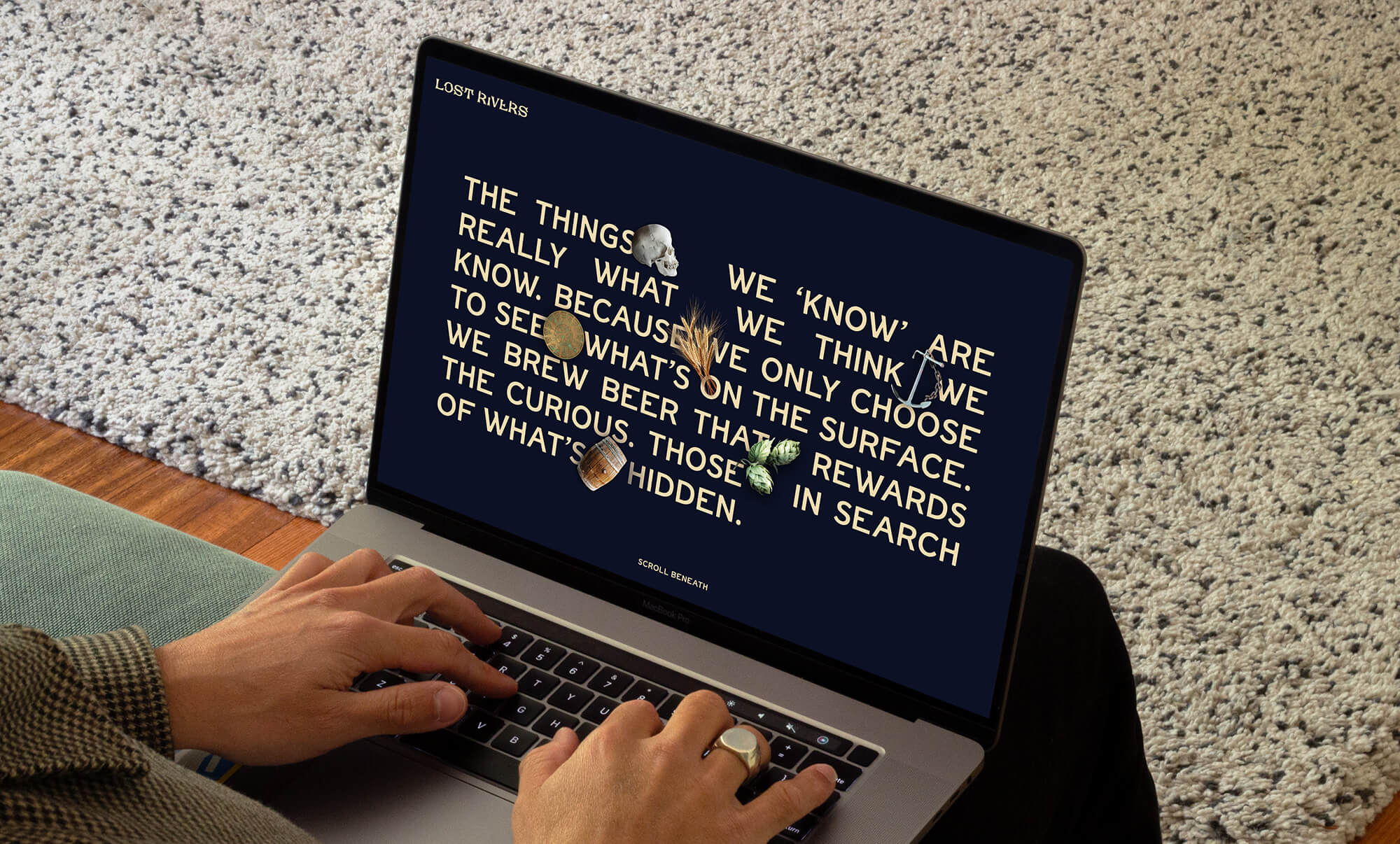
Although most of London’s rivers are now buried as sewers, their memories remain. Lost Rivers are on a mission to create great craft beer, inspired by the stories of the lost and the forgotten. The challenge was to craft an identity and packaging system that would stand out amongst the vast range of competitor brands, whilst channeling an activist spirit that champions the underdogs of society.
Scope
Brand Identity, Packaging, Website
Creative Direction, 3D
Paddy Carey
Design, Packaging, Website
Laura Clink
Featured on the Dieline