For people who follow their curiosity somewhere worth going
GOYA is a yoga retreat curation platform built on a simple conviction: the retreat market is full of options and empty of trust. Founded by practitioners, it exists as a considered edit of experiences where the teaching and the landscape are genuinely inseparable. Not a directory, not an algorithm. A point of view.
The original GOYA identity was created several years ago, when the platform was a broader yoga discovery tool. As its vision became more focused, prioritising retreats over general recommendations, slow living over quick wins and depth over volume, the identity needed to evolve with it. The refresh retains the spirit of the original while creating something quieter, more considered and better aligned with what GOYA has become.
Scope
Brand Identity, Stategy, Copywriting, Social
Creative Direction & Design
Laura Clink
Illustration
Emily Whieldon
Lucy Laughland
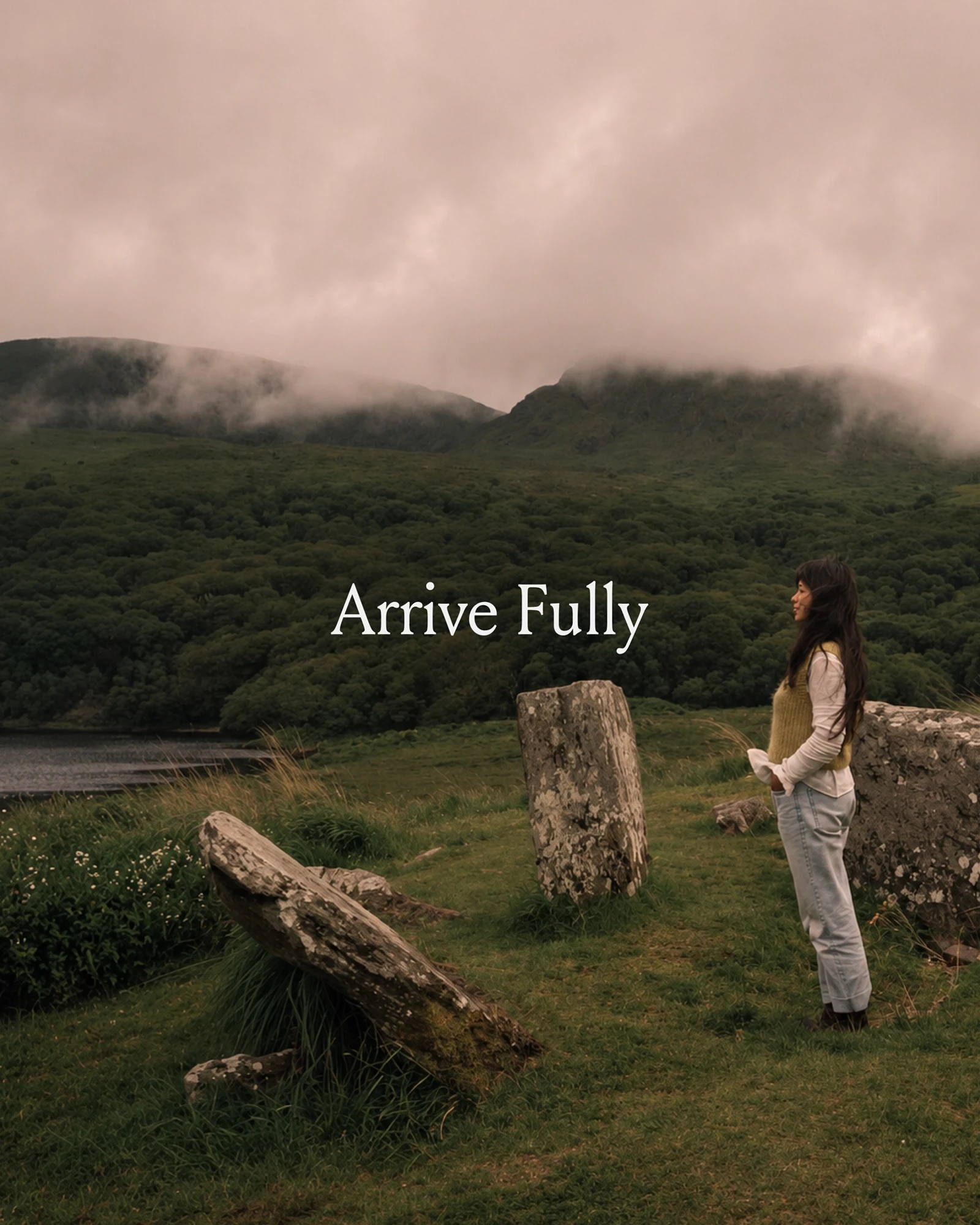
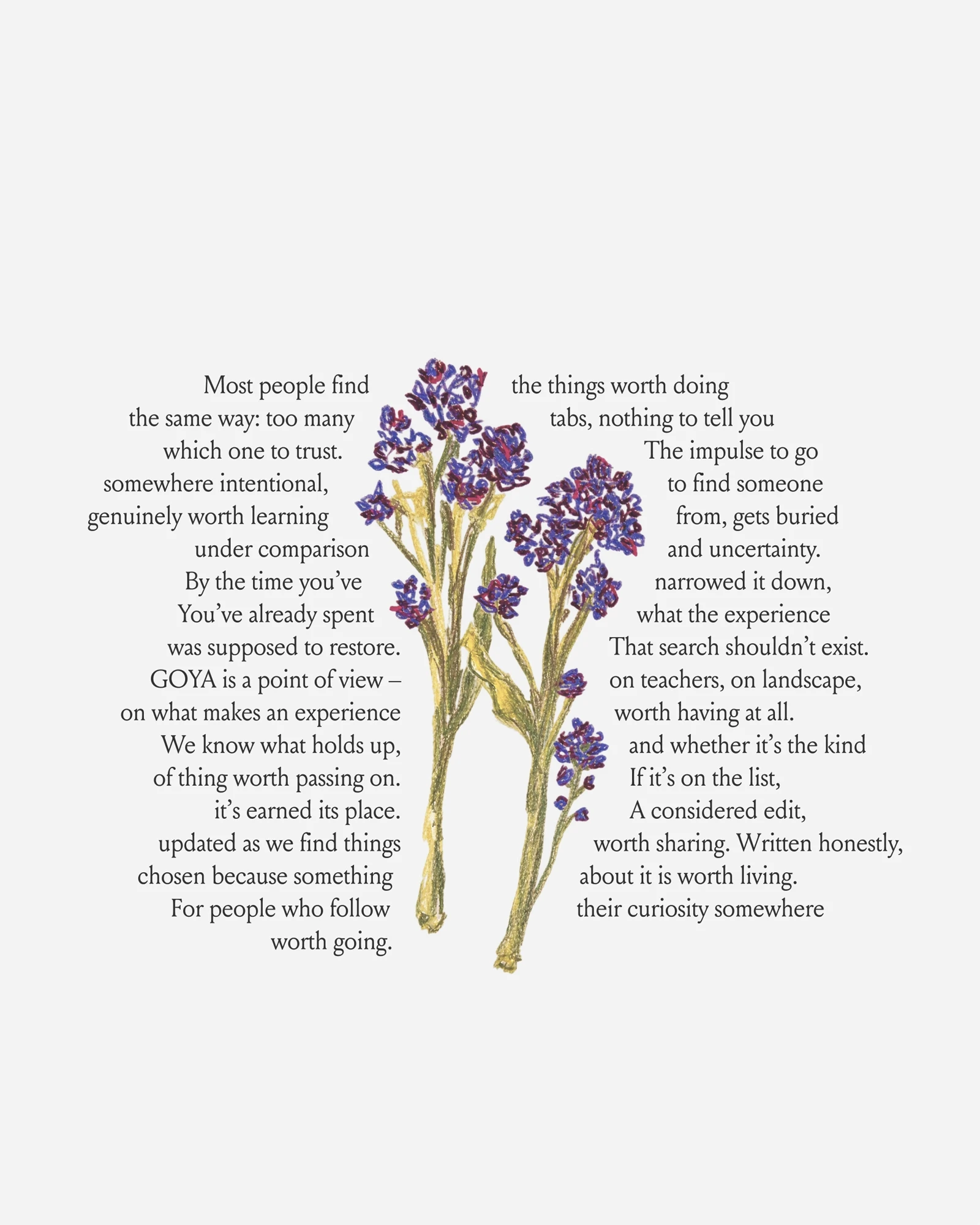


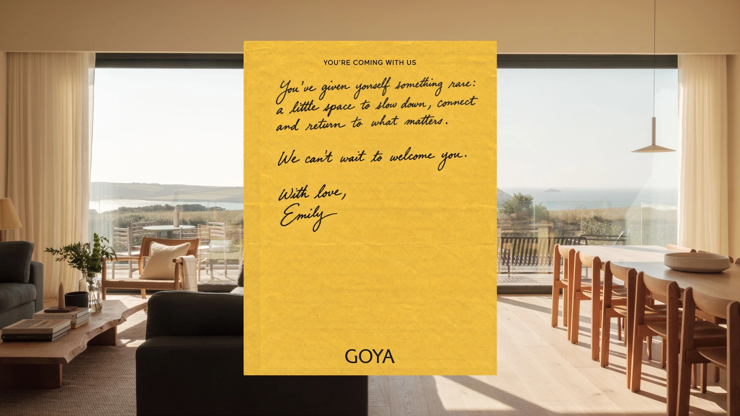
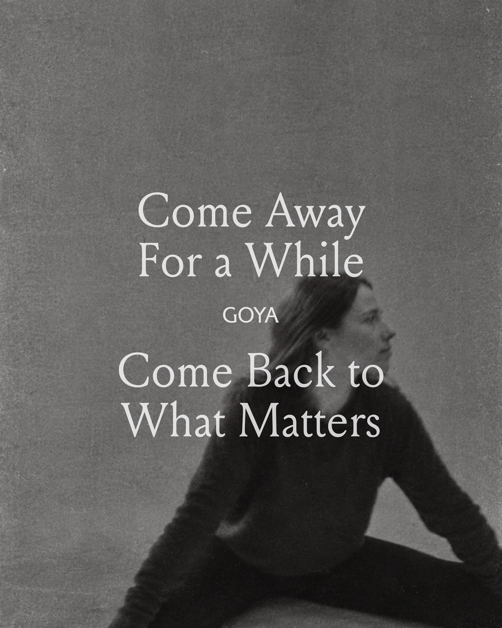
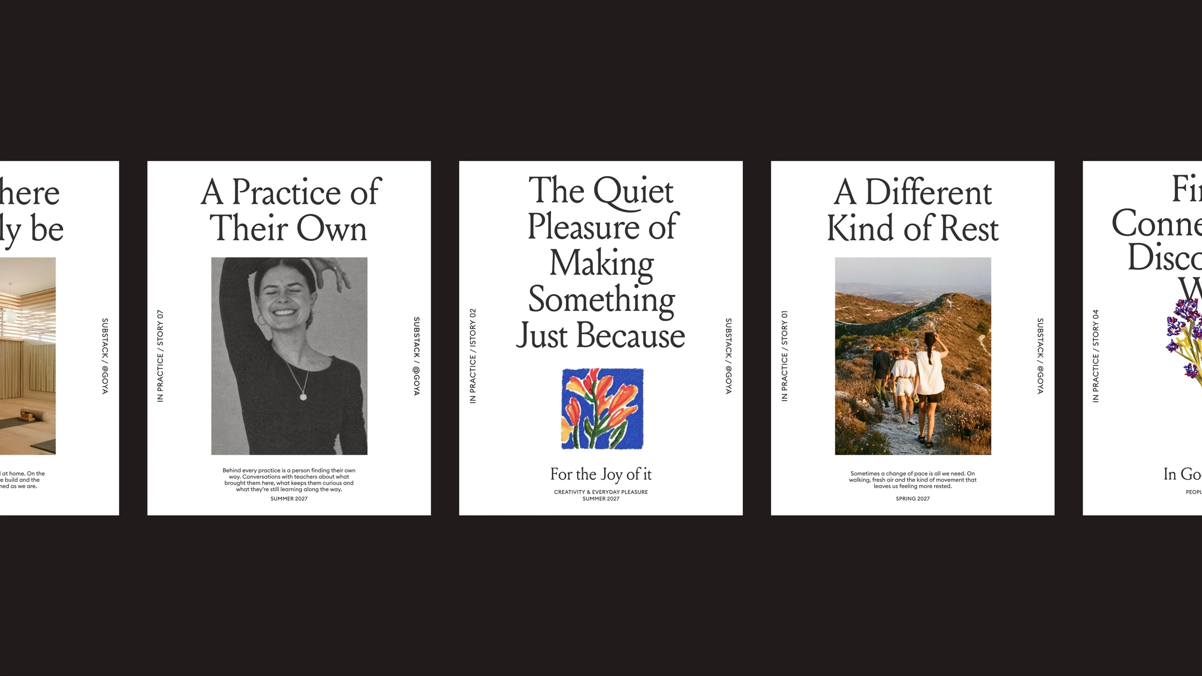
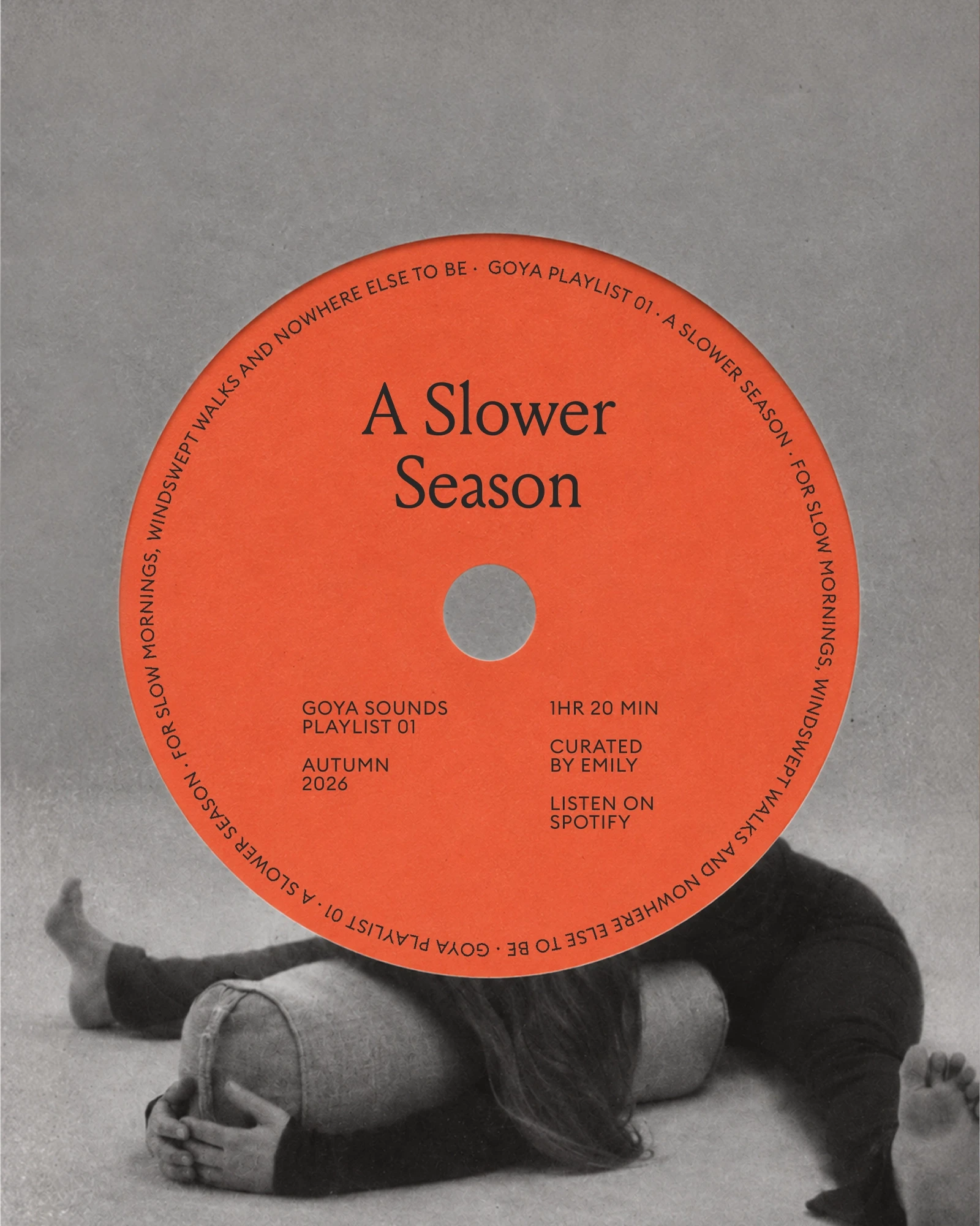
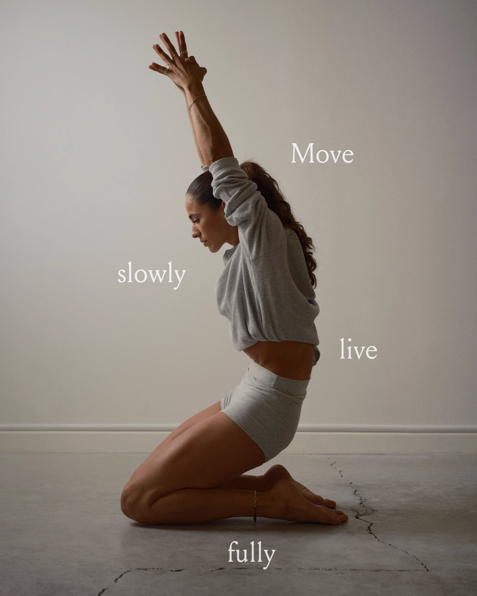
Guided by the idea that every saturated market eventually produces an editor, the new identity leans into quiet confidence. Unhurried layouts, generous white space and typography that rewards slowing down to read it. The visual world draws on the intimacy and permanence of independent publishing, designed to be returned to rather than scrolled past.
The brand holds a productive tension: inviting but selective, open in tone but restrained in its curation. It speaks to two audiences through one edit: the curious person who wants to place the decision in trusted hands, and the teacher who needs an audience that is genuinely ready for them.
Across positioning, identity, tone of voice and editorial direction, GOYA is built on the belief that curation only means something when it costs something to say no.